Shop All Crimsafe Security
Official Crimsafe® licensee – manufacturing and installing Crimsafe® every day.

Official Crimsafe® licensee – manufacturing and installing Crimsafe® every day.

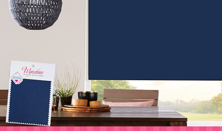
The world’s leading authority on colour trends, Pantone, has announced their prestigious Colour of the Year for 2020 and it’s a beauty. Classic Blue is a strong, dark rich blue similar to royal blue, inspired by the sky at dusk, symbolising calm, confidence and connection.
The prestigious Pantone selection process involves a panel of experts combing the world looking for new, emerging colour influences in art, entertainment, fashion, technology and design. For more than 20 years, Pantone’s Color of the Year has influenced product development and purchasing decisions in multiple industries – so expect to start seeing this gorgeous shade of blue everywhere!
Why we love Classic Blue
As a beautiful accent colour for your home when it comes to blinds and curtains, Classic Blue ticks a lot of boxes. Elegant in its simplicity, this distinctive shade is peaceful and tranquil. Blue is typically a colour which allows you to de-stress and can help instil focus. Plus, it looks super chic and stylish!
“We are living in a time that requires trust and faith. It is this kind of constancy and confidence that is expressed by Pantone Classic Blue which is a solid and dependable blue hue we can always rely on,” explained Leatrice Eiseman, executive director of the Pantone Color Institute. “As it’s imbued with a deep resonance, Classic Blue provides an anchoring foundation.”
Blinds and curtains can be great for colour accenting
Blinds are actually a great choice when deciding on an accent piece. Many people opt for white or neutral blinds and then add in pops of colour with accessories such as soft furnishings. However, there’s no reason not to make the blinds themselves a feature when they are available in so many beautiful colours nowadays.

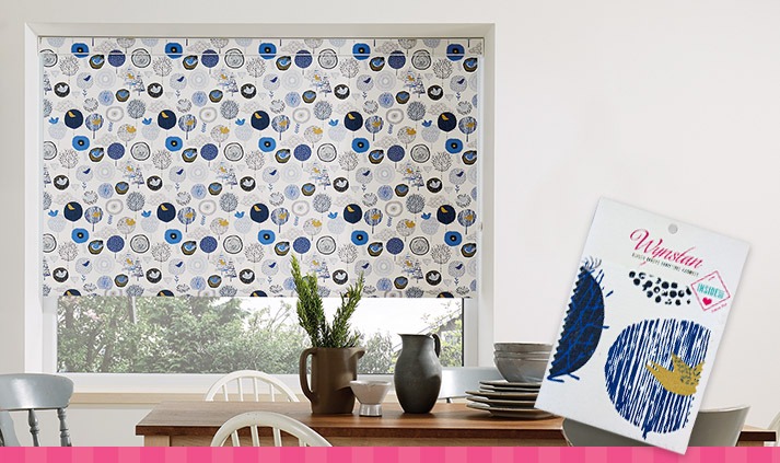
Wynstan’s Birdsong in Daybreak fabric features pops of Classic Blue alongside other shades of blue and gold motifs against a white backdrop. The Classic Blue in this print would make a great signature colour which could then be contrasted with gold accessories such as candle holders, cushions, vases etc. It would work equally well in a modern, industrial scheme with concrete or metal, or else in a more classic, beachy Hamptons type abode.
Other blue shades also make great choices
If you’re looking for a less vibrant hue, then Wynstan has a large range of fabrics in other shades of blue. For instance, Wildflower in Juniper features a teal blue contrasting with pops of mustard and dusky pink which would be a great compliment or feature point for a soft, romantic scheme.

The patterned Cherry Blossom in Kimono has a softer shade of blue offset by grey and white accents – perfect for a French Provincial look. Meanwhile if you’re looking for a solid block of colour to play with, Carnival in Breton Blue would be a great base that doesn’t overpower. This would look fantastic against accents of Millennial Pink.
So, don’t be shy when it comes to blue – explore the entire range of Wynstan’s blue hues and don’t forget to contact a consultant if you need a little help in deciding what would look best in your home – we’re here to help.
Share:
Contractor Licence 201996C
NSW Master Security Licence 408820264
Victorian Private Security Registration: 832-194-32S
© 2021 Wynstan – ABN 94 120 486 099
Browse over 400 fabric sample options for roller binds, panel glides, roman blinds and curtains too.
Add five FREE samples to your cart and we’ll ship them straight to your door! You can even add more for a small fee.
Love your choices? Book in a FREE measure and quote to take the next step to transforming your home.

Browse over 400 fabric sample options for roller binds, panel glides, roman blinds and curtains too.

Add ten FREE samples to your cart and we’ll ship them straight to your door! You can even add more for a small fee.

Love your choices? Book in a FREE measure and quote to take the next step to transforming your home.